

Mobile Fashion PDP Checklist for First-Time Buyers
A mobile fashion PDP checklist for first-time buyers: what the first screen must answer, gallery and buy button order, trust cues, and a real-device test today.

A first-time buyer on a phone should see what the product is, what it costs, and how it looks when worn, all on the first screen, then reach color, size, and add to cart without hunting. Open with a photo of the piece on a person, the title, and the price, keep delivery and returns terms beside the buy button, and test on real phones and in-app browsers before calling the page finished.
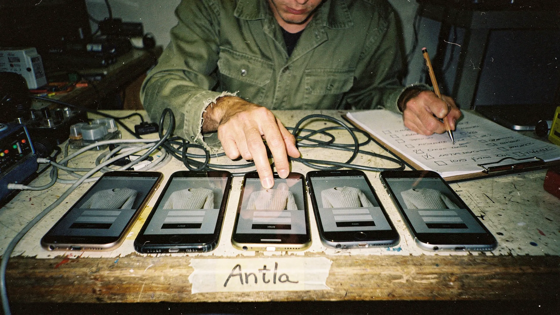
Same sweater, same page, five different first impressions. Editorial image in Classic Antla disposable-camera style.
Picture the shopper this checklist is for. She tapped an ad for a cream cable-knit sweater late in the evening, she has never heard of your store, and the product page opened inside the social app’s browser. She does not know how your sizes run, whether a return costs money, or whether the parcel will turn up at all. Everything she learns in the next minute comes from one narrow screen.
Returning customers forgive a weak mobile page because they already trust you. She has no reason to. Mobile is also where that gap shows: Baymard’s mobile ecommerce research notes that mobile often accounts for half of all traffic on ecommerce sites, while some mobile sites convert less than half as many visitors as their desktop versions.
Work through the checklist below on an actual phone. A desktop browser squeezed to phone width misses the things that trip new visitors up most: slow networks, in-app browsers, and thumbs.
Prioritize above-fold clarity
The first screen has three jobs for someone who has never bought from you: show what the item is, show what it costs, and show it on a person. Everything else competes for the same space.
- The first image shows the garment worn by a person, cropped so the piece fills most of the frame. Flat lays and wide lifestyle shots can come later.
- The title names the item in plain words, such as “Cable-Knit Crew Sweater”, even if it also has a style name.
- The price is visible without scrolling, and a sale price sits next to the original.
- The selected color is named in text, not only shown as a swatch.
- If you have reviews, the rating sits near the title and jumps to the reviews when tapped.
- Nothing covers the product photo on arrival: no email popup, no cookie banner over the image, no chat bubble on top of the price.
The on-body photo is not a style preference. In Baymard’s 2026 product page benchmark, 23% of sites did not provide a “human model” image, and the research singles out apparel, bags, jewelry, and other worn products as needing one. The same benchmark rated 62% of mobile sites “mediocre” or worse on product page experience, so a clear first screen is still a way to stand apart.
A quick test: screenshot the first screen on the smallest phone you can borrow and shade everything that is not the product. That means the announcement bar, the header, the breadcrumb, badges, and banners. If the shaded area is bigger than the product photo, start there. A two-line announcement bar and a tall pinned header are the usual culprits.
Review image and CTA order
Below the first screen, a new visitor tends to move in a predictable sequence: swipe through the photos, pick a color, pick a size, then decide. The page should follow that order instead of interrupting it.
For a knit sweater, a gallery that answers a stranger’s questions in order might run:
- Front view on a person, in the selected color.
- Back view on the same person.
- A side or walking shot that shows length and where the hem sits.
- A close-up of the knit, lit so the texture reads.
- The sweater on its own, flat or on a form.
- Any detail shoppers ask about: neckline, cuffs, lining, or how sheer the knit looks against light.
Two gallery details matter more on phones than on desktop. First, show thumbnails or at least a visible count. Baymard found that 76% of mobile sites don’t use thumbnails to represent additional product images, and a row of dots does not tell a new visitor that a back view exists. Second, put the model’s height and the size they are wearing right under the gallery, where the shopper is already forming a view of how the piece sits.
For the purchase controls, color, then size, then add to cart is the usual order, and it holds up. Check these on the phone itself:
- Sizes as buttons, not a dropdown. Buttons show at a glance which sizes are sold out; a dropdown hides that until it opens.
- A size guide link next to the sizes, not in a tab further down the page.
- A sticky add-to-cart bar that tells the truth. If you use one, it should show the selected color and size, it should never cover the size buttons, and tapping it with no size chosen should scroll to the sizes rather than fail quietly.
- Accelerated checkout directly under add to cart. Shopify’s accelerated checkout buttons appear with the Add to cart button and let a customer check out with details already attached to Shop Pay, Apple Pay, or Google Pay. For a first-time buyer who already uses one of those wallets, that means paying without typing a card number and address on a small keyboard.
The fuller case for gallery order, including which shots to cut, is in fashion product pages that convert before you run ads.
Add confidence cues
A returning customer already knows your sizes run small and your returns are free. A first-time buyer has to find that out on this page, and she looks for it near the buy button. Put the answers there, in plain text, and make each one specific.
| Question a new buyer has | Cue that answers it | Where it goes |
|---|---|---|
| When will it arrive? | An estimated delivery date or range | Directly under the buy button |
| What if it’s wrong? | Return window and cost, in one line | Under the delivery line |
| Which size do I pick? | Model height and size, size guide, fit notes from reviews | Beside the size buttons |
| What is it made of? | Fiber content, weight or thickness, lining, care | First line visible, the rest expandable |
| Is this a real store? | Customer photo reviews and a visible way to reach you | Reviews below the buy area, contact in the footer and policy pages |
Customer photos do two jobs at once for this shopper: they show that other people bought the piece, and they show it on bodies other than the model’s. The guide to photo reviews and social proof for fashion brands covers how to collect them and where they belong.
Go easy on badges. A row of generic icons for secure checkout, satisfaction, and fast shipping reads as filler and pushes the buy button down the screen. One specific line, such as “Free returns within 30 days”, does more than five icons, as long as it is true for every order, sale items included.
Some first-time buyers get past all of this and still hesitate over a different question: how this color and cut will look on them. A virtual try-on preview answers that one. Antla’s virtual try-on adds it to the product page as a single button, and because it shows appearance rather than size or physical fit, it sits beside the size guide instead of replacing it. It is on the Shopify App Store if you want to trial it on one best seller.
Validate on devices
Real phones differ in screen height, processor speed, text settings, and the browser a page opens in. A short matrix catches most of what a desktop preview misses.
| Setup | Why it matters | What to check |
|---|---|---|
| Small iPhone, such as an SE | Least vertical space | Price and color on the first screen; sticky bar clear of the sizes |
| Large iPhone | Top corners are hard to reach one-handed | Close buttons, gallery arrows, the menu |
| Older mid-range Android | Slower processor, often a slower connection | How long the main photo takes; layout jumps as reviews and fonts load |
| Instagram and TikTok in-app browsers | Where paid social visitors land | Popups, which checkout buttons appear, what the back button does |
| Enlarged text in phone or browser settings | An accessibility setting real shoppers use | Wrapped size buttons, cut-off titles, price and badges overlapping |
Then check speed. The main product photo is often the largest thing on a mobile product page’s first screen, which makes it the element that Largest Contentful Paint times. web.dev recommends 2.5 seconds or less, measured at the 75th percentile of page loads and split by mobile and desktop. Load the page on a throttled mobile connection in your browser’s developer tools and watch what appears first. If the gallery waits for a slider script before showing any photo, a new visitor spends that time looking at an empty box where the sweater should be.
Paid social deserves a separate pass, because the ad opens your page inside the app rather than in Safari or Chrome. The piece on why paid social traffic bounces on fashion sites covers how to check in-app loading against the promise the ad made.
If every box is ticked and sales stay flat
A checklist confirms that the parts are present. It cannot tell you whether they are the parts your new visitors were missing, or whether the problem sits somewhere other than the product page.
- Returning customers blur the picture. They buy on mobile regardless and lift the average. Separate new from returning visitors before judging a change; the guide to finding conversion leaks in a Shopify apparel store shows how to split them by landing page.
- The traffic may be the problem. If most new mobile visitors come from one campaign whose ad showed a different color or price, no page fix closes that gap.
- One device can hide inside the average. If product views are healthy and add-to-carts collapse on one phone or browser, work through why fashion product views do not become add-to-carts before redesigning anything.
- Too many changes land at once. Ship the first-screen fixes as one release, then change one thing at a time, so you can tell what moved the number.
Hand the phone to someone new
Pick the product page that gets the most first-time mobile visitors, usually a best seller or the page your ads point to. Hand a phone to someone who has never shopped with you, open that page, and give them five tasks without any help:
- From the first screen, say what the item is and what it costs.
- Find a photo of the back.
- Choose your size.
- Find out when it would arrive and what a return would cost.
- Add it to the cart.
Watch where their thumb stops. A pause on the third task usually means the size guide is hard to find, and a pause on the fourth usually means delivery and returns live only in the footer. Fix whatever caused the longest pause, then repeat the test with someone else.
About the author: Aaron founded Antla and thinks every product page should be signed off on the slowest phone anyone can find.