

Best Virtual Try-On Button Placement on Shopify PDPs
Compare a Shopify product-page try-on button in the gallery and beside the buy box, then test it against thumb reach and the theme. Then run a two-week holdout.

On a Shopify product page, test the try-on button in the image gallery against the same button beside the price and size controls. On a phone, the lower purchase area is easier to reach, and the gallery is where the picture question starts. The theme decides which of those spots you can actually use. Pick a winner with a test, not with a screenshot.
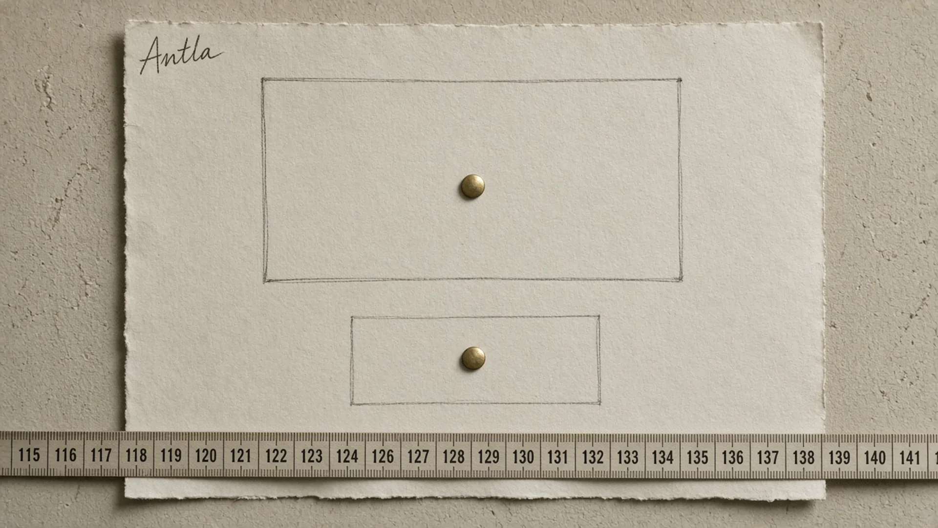
Two candidate spots, and a ruler, before anyone argues from a desktop mock. Editorial image in Classic Antla disposable-camera style.
“Put it above the fold” is not a placement. On a Shopify product page the fold is a theme accident: a tall gallery, a sticky buy box, a reviews block that loads late. I have seen a carefully designed button land under a payment-icons row on mobile and win a desktop review anyway.
Two candidate homes are worth a real comparison. The gallery, where shoppers are already judging pictures. The purchase area, beside price, size, and add to cart, where the decision is supposed to end. Everything else, a footer banner, a tab called “experience,” a button that only appears after scroll depth, is a way to say you have not chosen.
Adding virtual try-on on Shopify is the install. PDP conversion work for fashion is the rest of the page. This is the argument about where the control sits, and how you would know.
Compare gallery and purchase area
The gallery placement treats try-on as another way to see the product. The purchase-area placement treats it as part of the buy decision. Both can be right on the same store for different products. They cannot both be unmeasured.
| Gallery | Purchase area | |
|---|---|---|
| Shopper’s posture | Looking at pictures | Choosing a size and a price |
| Strength | The “on me” question is asked while the photos are up | The control sits with the other commitments |
| Risk | The control scrolls away, or moves when the image changes | It crowds size, quantity, and add to cart |
| Result image | Can return into the carousel beside studio photos | Has to stay tied to the option they selected |
| Bad version | A button baked into slide 3 of 8 | A text link under the trust badges |
Antla supports both ideas in the product, with a constraint you should read before you mock. The default control is a button on the product page. The result can sit in the gallery carousel with the other photos. Current custom button docs show the override: hide .antla-button with display: none (the node stays in the page), render your own button in a gallery selector, and call openModal() on antla-block. That is a real gallery placement. It is also a theme dependency. If the selector changes in a theme update, your button vanishes and the hidden default stays hidden.
I would not hide the default until the replacement has been tapped on a phone, on the live theme, on a product whose first media is a video. Image selection exists because the first file is sometimes the wrong one to try on. A gallery button that generates from a video poster will produce a fight in the reviews.
The purchase area has a different failure. Themes stack a lot under the title: price, reviews stars, a size chart link, a quantity stepper, add to cart, a shop-pay row, a delivery estimate. A try-on button that lands beneath all of that is technically “in the buy box” and practically invisible. Put it next to the size control if the open question is appearance, and keep the size control. Moving the button does not turn a preview into a fit tool. Hesitation metrics are how you tell whether shoppers are stuck on size, photos, or a dead control.
One placement can be the primary and the other a duplicate, but duplicates split the measurement and annoy people who see two of the same button. Pick one visible control for the test. You can keep a second, visually quieter path later, after you know which one earns the tap.
Account for mobile thumb reach
Most of the placement debate happens on a laptop mock, where every pixel is easy to hit. The traffic is on a phone, and the phone is not held the way the mock assumes.
Steven Hoober watched 1,333 people with phones in 2013 and wrote it up for UXmatters. He saw three holds: one-handed 49%, cradled in two hands with one hand touching 36%, and two-handed 15%. In a 2017 follow-up he warned that the popular “75% of touches are a thumb” line misleads, because fewer than half of people are also holding the phone in one hand, and people change grips for the task. Phones have grown since those studies. The top of a tall product gallery is a worse reach than it was on a smaller screen. I would not invent a new percentage for that. I would stop treating a desktop “above the fold” as a mobile convenience.
What that means on a product template:
- If the gallery is the top half of the phone, a button in the upper corner is a stretch for a one-handed hold.
- If the buy column sticks to the bottom, or simply sits under the gallery, it is the easier tap. It is also where the thumb is already going for add to cart.
- A control inside a swipeable slide moves. The shopper aims, the slide changes, the tap hits the next photo. Place the gallery button on the gallery frame, not inside a single image.
- The target has to be large enough to hit. Apple’s current layout guidance asks for controls of at least 44 by 44 points. A text link at 12 pixels under the price is not a placement. It is a caption.
Report the test on mobile as its own column. A gallery button that wins on desktop can lose on a phone for a reason no heatmap of a 1440-pixel window will show. Watch a handful of mobile recordings of people who viewed the product and did not start a preview. If their thumb never travels to the control, you have a reach problem. If they reach it and hesitate, you have a copy or a trust problem, and moving it will not help.
Check theme constraints
Shopify themes do not offer a free coordinate for an app button. Current theme app extension docs distinguish app blocks, which merchants place inside a section, from app embed blocks, which inject more globally. Current support checks are blunt about blocks: the template needs to be JSON, and the section needs to accept a block of type @app. On a vintage theme, or a product section that does not allow app blocks, you do not get to drop a block between the gallery and the price. You get an embed, or the custom-button route above.
Before a placement test, answer these on the live theme, not on a fresh Dawn install:
- Is the product template JSON, and does the main product section allow app blocks?
- Can a block sit in the media column, the info column, or only as a full-width section under both?
- Does a sticky add-to-cart bar cover the control once the shopper scrolls?
- What is the first media on the bestseller: an image, a video, or a 3D model?
- If you hide
.antla-button, does your replacement still callopenModal()after the last theme update?
Antla’s virtual try-on is built to run across Shopify themes without a code project, and the default button will appear. “Across themes” does not mean “in the pixel you chose on a screenshot.” Shopify’s app listing habits and a Friday QA pass are different activities. Do the QA pass on the theme you sell with, including a product that uses a combined listing or a heavy gallery if that is how your catalog works.
If the theme only allows the button in one legal slot, skip the A/B test and fix that slot: target size, contrast against the photos, and a label that says what will happen (“See it on you”) rather than a brand name alone. A test of two illegal positions wastes a month.
A/B test placement
Two arms. Gallery frame versus purchase area. Same products, same weeks, same campaign traffic. Assignment happens on the first product view and sticks for the session, so a shopper does not see the button jump.
| Decide before you start | Why | |
|---|---|---|
| Primary metric | Add to cart per product view, or orders per product view | Pick one. Starts are easier to move and easier to misread |
| Secondary | Try-on starts per product view, completions per start | Tells you whether the tap was the problem or the wait |
| Guardrail | antla_image_generated_error rate, revenue per session | A placement that increases errors is a broken selector, not a win |
| Split | Mobile and desktop reported separately | Reach is a phone issue |
| Comparison group | The other placement, same period | Last month’s conversion rate is a different store |
The comparison group is the other arm. Not “before we had try-on.” Not the storewide conversion rate. If the gallery arm starts more previews and adds to cart at the same rate, the gallery is collecting curious taps. If the purchase-area arm starts fewer previews and adds more among the people who finish one, that can still be the better commercial placement. Write which of those outcomes you will ship, in the ticket, while both outcomes are still hypothetical.
Shopify’s theme editor will not run this for you. Assign the arm in the theme, store it for the session, and record it on a custom pixel. Current Web Pixels docs cover publishing custom events from the theme. Include the arm name, the product id, and whether the tap was gallery or purchase area. Pair it with standard product_added_to_cart.
Across 500,000+ try-ons, shoppers who complete a try-on convert at 3.8%. People often set that next to a typical Shopify all-store rate around 1.4%, or a typical Plus rate around 2.1%. Those are different denominators: a try-on-user rate versus a storewide rate. It is not your store’s conversion rate, and it does not know which button was on the page. Antla merchant reporting, cohort dates not published. The placement test above is the comparison that can actually move your theme.
Do not end the test on the first winning day, and do not apply a desktop winner to mobile because the chart was easier to read. If the arms are still overlapping after the sample you committed to, keep the control that is easier to maintain in the theme. A tie goes to the placement your next theme update is less likely to break.
Two placement myths
Above the fold always wins. On a phone, the top of the fold can be the hardest reach on the screen. Above the fold is a visibility claim. Reach is a different claim. Measure both or you will promote the button people can see and cannot comfortably tap.
The gallery is more immersive, so it converts. Immersion is not on the event list. The gallery is a good place when the shopper’s question is about the picture. The purchase area is a good place when they are already choosing a size. The recordings and the add rate will tell you which question you have. A mood board will not.
A two-week placement test
One theme, one product template, mobile in its own column. Hide nothing until the replacement button works with the gallery you actually ship. Write “primary metric: add to cart per product view” in the ticket, name the two arms, and turn the split on. At the end of two weeks, ship the arm that wins on that metric without raising generation errors. If neither arm wins, leave the button in the purchase area beside the size control and spend the next week on the photos and the size guide, which is where a product page stalls more often than in the button’s coordinates.
About the author: Aaron founded Antla and has lost more placement arguments to a sticky cart bar than to a competitor.