

Outfit Styling vs Single Garment PDPs
Should an apparel page lead with a styled outfit or the single garment? Map intent, weigh basket size against clarity, and test the cross-sell. Pick one hero.

Lead with the single garment when the shopper came for that item, and lead with the styled outfit when she came for the look. An outfit hero can raise units per order, and it can also hide the price, the fabric, and which piece is actually for sale. Map the intent, keep the hero obvious, place outfit recommendations where they do not block the buy button, and test units per order against add-to-cart rate.
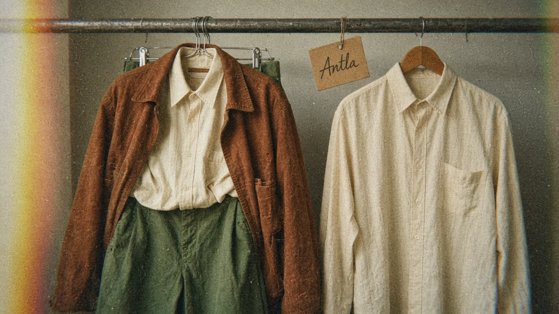
The left hanger sells a Tuesday. The right hanger sells a shirt. Editorial image in Classic Antla disposable-camera style.
Two ads can point at the same cream shirt and ask the page to do opposite things. One ad is a close crop of the shirt, with the price in the caption, for someone who already wants that shirt. The other is a full look: rust jacket, cream shirt, olive trousers, no prices, for someone who wants to look like the picture. Send both clicks to one template and you will disappoint one of them.
The choice is which story the first screen tells. Outfit-first and garment-first are both legitimate. They fail when the page pretends to be the other one. Combined listings, which group separate products so they behave like color options, are a different build. That setup is in the breakdown of variant images and combined listings. This page is about merchandising order: look first, or piece first.
Map buying intent
Read the click before you design the hero. Intent is visible in the query, the collection, and the ad, and each one deserves a first screen that matches it.
| How she arrived | What she is trying to decide | First screen that matches |
|---|---|---|
| Search for “cream oxford shirt” | This shirt: fabric, price, sizes left | The shirt on a person, title, price |
| A collection called “Shirts” | Which shirt, then whether this one | The shirt, with outfit ideas below the buy button |
| An ad or edit titled “The Tuesday uniform” | Do I want this whole look | The styled outfit, with each piece named and priced |
| A lookbook or homepage story | Browse the world, then pick a piece | The outfit, and a clear path into each garment |
| A returning customer with the shirt in her history | A replacement or a second color | The shirt, and only then “wear it with” |
The expensive mismatch is a search click that lands on a styled hero where the shirt is a third of the frame and the jacket is the thing she remembers. She adds nothing, or she adds the jacket by mistake. The other mismatch is an outfit ad that lands on a flat lay of the shirt alone, so the look she tapped is gone. Both are the same bug as a broken promise, which is the diagnosis in why paid social traffic bounces on fashion sites.
Write the intent on the brief for the template, in one line: “This page sells the shirt” or “This page sells the Tuesday look.” If the team cannot pick, you have two pages, not one compromise hero. A product template can still wear a small outfit module. A look template can still list the three SKUs. The first screen should not try to be both at full volume.
I would default a normal product URL to the garment. I would build a separate look URL when marketing is paying to sell the combination. Sharing one hero across both jobs is how the shirt page gets crowded and the outfit page gets vague.
Compare basket size and clarity
Outfit styling is attractive because the basket math looks friendly. A shirt at $48 becomes a shirt, a jacket, and trousers, and units per order move. Clarity is the cost on the other side of that math, and clarity is what makes the first unit happen at all.
On a garment-first page, the shopper can answer four things without hunting: what the piece is, what it costs, what it is made of, and which size is in stock. The outfit is a suggestion she can take after she trusts the shirt. Basket size grows from a decision she already made.
On an outfit-first page, the shopper is asked to want three things before she understands one of them. That can work when each piece is labeled, priced, and clickable in the first screen, and when the page says whether she is buying a bundle or three separate products. It fails when the hero is a photograph of three garments and the add-to-cart button belongs to whichever product the URL happens to be. She thinks she is buying the look. The cart contains the shirt.
Google’s rules for the main product image draw the same line for the feed: do not include a product that is not sold together with the main one. A coat photo with a bag and boots is a styling image. It is a weak image_link for the coat unless the bag and boots are part of that offer. Use the styled frame in the gallery and in the campaign. Use a frame of the piece you sell as the file Shopping and ads will treat as the product.
If you do sell the three pieces as one offer, make that true in Shopify, not only in the photograph. Shopify Bundles can build a fixed bundle or a multipack from the admin, on any plan, with the component products still tracked. A bundle has its own limits: combined listings cannot be added to one, and the storefront has to show what is inside. A styled photo with three separate add-to-cart buttons is not a bundle. Call it what it is, or the analytics will credit the parent and the warehouse will pick three children nobody explained.
Track both sides for a month before you fall in love with units per order:
| Reading | Garment-first tends to show | Outfit-first tends to show |
|---|---|---|
| Add-to-cart rate on the hero SKU | Higher, because the piece is obvious | Lower when the hero hides the piece |
| Units per order | Lower until recommendations attach | Higher when the look is actually bought |
| Revenue per session | Depends on the attach rate | Depends on whether the first unit survives |
| ”Which item is this?” contacts | Rare | Common when labels are missing |
| Returns on attached pieces | Lower if each PDP did its job | Higher if she bought a jacket she never inspected |
Revenue per session is the number I would take to a meeting. Units per order flatters a page that adds a cheap pair of socks and loses the shirt. Add-to-cart rate on the hero flatters a page that never suggests the jacket. You want both, and you want the return rate on anything the outfit module added.
The shirt still needs its own evidence: on-body photo, fabric, price, sizes. If views of the shirt are healthy and carts are not, the outfit hero is a suspect, and so are imagery and price. The worksheet for product views that do not become add-to-carts is the right second pass when the hero change does not explain the gap.
Place outfit recommendations
Once the first screen has a job, the outfit belongs in a labeled block, not in the title treatment.
Baymard’s research on alternative and supplementary suggestions separates the two. Alternatives help her find a different shirt. Supplementary items help her finish the look: the jacket, the trousers. In that benchmark of major sites, 58% offered only one of those, or mixed both in the same element, and 42% offered both. Mixing them in one carousel teaches her that every tile is a maybe. Split the headings.
For a shirt page I would use this order:
- Gallery of the shirt, first frame on a person, in the selected color.
- Title, price, color, size, add to cart.
- A short “Wear it with” row: two or three pieces, each with a photo, a full title, and a price.
- A separate “Other shirts” row, lower, for people who reject this one.
- Reviews and fabric details where your template already puts them.
The “Wear it with” row should sit below the buy button on mobile, not above it. A carousel of outfits between the price and the sizes is how the shirt loses the thumb. Each tile needs enough to judge without a click: image, name, price. A tile that is only a crop of a jacket forces a detour, and a detour at that moment loses the shirt and the jacket.
Label the relationship in words. “Wear it with” is a complement. “You may also like” is usually an alternative. The essay on why fashion shoppers browse and leave makes the same split: a row of similar trousers feeds comparison, and a row that completes the outfit feeds the basket. Most stores need both, with headings that say which is which.
If she taps the jacket, she should land on the jacket’s own page, with the jacket as the hero, not on another copy of the Tuesday photograph. The outfit is a path between product pages. It is not a reason for every URL to open on the same styled frame.
A try-on button, if you use one, belongs to the garment on the URL she is viewing. It shows how that piece may look in her photo. It does not style the jacket and the trousers onto her, and it does not check a size. Antla merchant reporting, cohort dates not published, shows shoppers who open try-on staying roughly two to three times longer than the comparison group: shoppers in the same stores who never open it. Cohort dates are not published. The denominator is openers versus non-openers. Longer sessions are not orders, and they are not a reason to lead the page with an outfit. How to read time on page without treating it as intent is the point of product page engagement and conversion quality.
Test cross-sell effects
Opinions about heroes are cheap. A two-arm test on one collection is enough to settle the argument for that collection.
- Arm A, garment-first. The shirt is the first image and the add-to-cart target. “Wear it with” sits under the button, with image, title, and price on each tile.
- Arm B, outfit-first. The first image is the styled look, with the three pieces named and priced in the first screen, and the shirt still the default add-to-cart unless you are truly selling a bundle.
Hold the prices, the size UI, and the recommendation set steady. Change the hero and the labels. Run full weeks. Split mobile and desktop. Decide the primary metric before you launch.
| Metric | Comparison | What a win looks like |
|---|---|---|
| Add-to-cart rate on the hero SKU | Arm A vs arm B, all sessions | The outfit arm does not give the shirt away |
| Units per order | Same | The outfit arm attaches real second pieces |
| Revenue per session | Same | The extra units are worth more than any lost shirts |
| Attach rate of the named complements | Same | The jacket and trousers move, not a random third SKU |
| Return rate on attached pieces | Same, after orders age | She inspected them, or the attach was a mis-tap |
| Support tags for “wrong item” | Same | Labels were clear enough to buy the intended piece |
The comparison group for each metric is the other arm, on the same products, over the same weeks. Last month versus this month mixes season, ads, and stock. A winning outfit arm that lowers hero add-to-cart and raises units can still lose on revenue per session. Read that line before you roll the hero out to the whole catalog.
Small stores will not get a clean read on every shirt. Limit the test to the collection you actually style as outfits, or to the five shirts your ads already use. If traffic is thin, ship garment-first, add the labeled row, and compare the two weeks before the row with the two weeks after, knowing that a before-and-after read is weaker than an arm test.
Ignore the first few days. New modules get tapped because they are new. A two-week window is the minimum I would trust, and I would extend it if a sale or a drop lands in the middle.
Where outfit-first pages mislead
- The photograph is the only label. If the jacket has no name and no price on the hero, some shoppers will buy the shirt and believe they bought the look.
- One carousel, two jobs. Alternatives and complements in the same row train people to skip both.
- The feed uses the styled frame as the product. Unsold pieces in the main image confuse Shopping and the ad that follows.
- A bundle that is not a bundle. Three products in one photo, one variant in the cart, and a finance report that cannot see the components.
- Try-on treated as the outfit. A preview of the shirt does not show the jacket on her, and it does not tell her a size.
Pick the hero for one collection
Choose the collection that your ads and edits already treat as outfits. For every URL in it, write “sells the piece” or “sells the look” on the brief. Rebuild the first screen to match that line: garment, price, and on-body photo, or the styled frame with each piece named and priced. Put “Wear it with” under the buy button, separate from “Other shirts,” and run the two-arm test for two full weeks.
I would rather lose a styled hero than hide the price of the shirt. The outfit can sell the second and third unit. It should not be allowed to obscure the first.
About the author: Aaron founded Antla and has watched a styled hero sell a jacket while the shirt did the work.