
Try-On and Size Selector Order on Apparel PDPs
Should virtual try-on sit before or after the size selector? Separate appearance preview from size help, map shopper questions, then test the order. Start there.

On most apparel product pages, put the virtual try-on entry after the color selector and before the size selector. Shoppers usually decide whether they like how a piece looks before working out which size to buy, and the preview should show the colorway they picked. Try-on shows appearance, not fit, so keep size guidance beside the size selector, then test the order and confirm the previewed variant is the one added to cart.
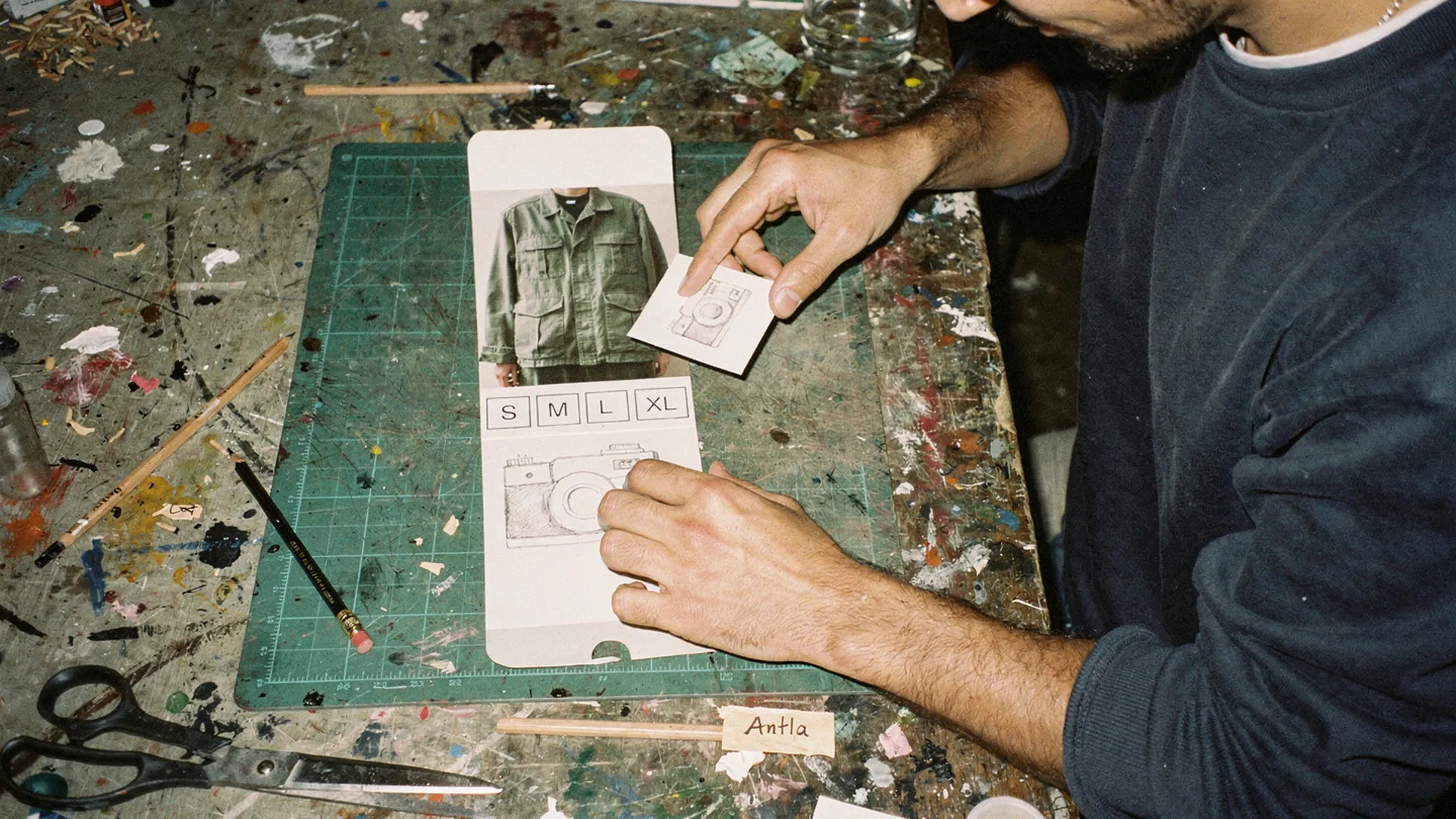
Three paper strips, one small card, and a surprisingly long argument about where it goes. Editorial image in Classic Antla disposable-camera style.
Picture the buying column of a jacket page on a phone: price, a row of four color swatches, size buttons from XS to XL, a “Size guide” link, and the add-to-cart button. Now add a “Try it on” button. It can realistically go in three places: inside the image gallery, between color and size, or down beside add to cart.
Each position makes a claim about what the button does. A try-on button tucked into the size area looks like a sizing tool, and a shopper who previews the jacket after tapping M may reasonably assume the preview shows a medium. It does not. A virtual try-on renders how the product may look in the shopper’s photo. It does not measure a body or check a size.
Clarify preview vs size recommendation
The two tools answer different questions from different inputs, and the page should never blur them.
| Virtual try-on preview | Size recommendation or size guide | |
|---|---|---|
| Question it answers | How might this piece look on me? | Which size should I order? |
| Input | The shopper’s photo plus a product image | Measurements, height and weight, past orders, or a size chart |
| Output | An AI-generated image | A size label or a chart |
| Changes when | The color or style changes | The size or the shopper’s measurements change |
| Honest claim | Color, silhouette, styling | Fit guidance, with its own error rate |
The last row matters most for copy. Labels like “See your fit” or “Check your size” promise something a preview cannot deliver. The FTC’s advice to advertisers on keeping AI claims in check says performance claims are deceptive if they lack scientific support, or if they hold only for certain users or under certain conditions. “Try it on” and “See it on you” are accurate. “Find your size” is not, unless the button really opens a size tool.
If you run both tools, give each its own home on the page. The comparison of AI size recommendation and virtual try-on covers when a store needs one, the other, or both.
Map shopper questions
The cleanest way to settle button order is to list the questions a shopper asks, in the order they usually ask them, and give each question one answer in one place.
| Shopper question | What answers it | Where it belongs |
|---|---|---|
| Is this the kind of thing I want? | Main image, title, price | Top of the page |
| Which color do I like? | Swatches that switch the gallery | Directly under the price |
| Does this color and cut suit me? | Try-on preview, on-model photos | After color, before size |
| Which size should I order? | Size guide, garment measurements, model height and size worn | Beside the size selector |
| What if it does not work out? | Returns window and cost | Near add to cart |
| When will it arrive? | Delivery estimate | Near add to cart |
Rows three and four carry the argument. Baymard’s research on apparel size information recommends placing the size guide link near the size selectors, because many testers overlooked the link entirely when it was not next to them, and it lists model measurements as useful context when choosing a size. Wedge a try-on button between the size buttons and that link and you push sizing help away from the control it explains.
The size control itself deserves attention while you are in there. Baymard’s 2026 product page benchmark found that 57% of sites still do not use buttons for size selection, and Baymard’s testers were prone to overlook size options hidden in drop-downs. If your sizes live in a menu, fix that before you argue about where try-on goes.
Row three also explains why try-on should follow color. A preview is built from a product image, so the image in use when the shopper opens the preview decides which colorway they see on themselves. Put the button above the swatches and some shoppers will preview the default color, dislike it, and never discover the sage version.
There are sensible exceptions. For single-color pieces, the gallery is a fine home for the button. For categories where silhouette is the main doubt, such as wide-leg trousers or a structured blazer, an entry point near the photos can work because shoppers are judging the cut while they look at the images.
Test sequencing
Opinions about button order are cheap, and a two-arm test is not much more expensive. Pick the two positions your theme can support cleanly, not every position you can imagine:
- Arm A: try-on entry directly under the color swatches, above the size buttons.
- Arm B: try-on entry inside or directly under the main image gallery.
Add a third arm beside add to cart only if you have the traffic to split three ways. Keep everything else fixed: the label, the button style, and the position of the size guide link. Run the test in full weeks, read mobile and desktop separately, and choose the primary metric before launch.
| Metric | What it tells you | What to watch for |
|---|---|---|
| Try-on opens per product view | Whether the entry point is seen | Opens rising while completions fall, a sign of accidental taps |
| Completed previews per open | Whether shoppers finish | Drop-off at the photo upload step |
| Add-to-cart rate after a completed preview | Whether the preview helped the decision | Compare within each arm, not across |
| Add-to-cart rate across all product sessions | The guardrail | Any arm that lowers it loses, whatever try-on numbers say |
| Size guide opens and size changes | Whether try-on crowded out size help | Size switching rising around the new button |
Antla fires browser events you can count, including antla_modal_open, antla_image_generated_success, and antla_product_added_to_cart, all listed in the custom events documentation. Forward them to your analytics tool with the test arm attached. For size changes and guide opens, the PDP hesitation metrics guide shows how to publish your own events.
Be careful with try-on-user numbers while the test runs. Antla merchant reporting, cohort dates not published, puts conversion among shoppers who completed a preview at 3.8% across more than 500,000 try-ons. That rate describes a self-selected, high-intent group, not the whole store. A position that attracts more motivated shoppers can look better on that metric without selling more, so judge the arms on all-session add-to-cart rate and orders.
My starting bet is arm A for multi-color apparel and arm B for single-color statement pieces. I would still run the test, because themes and audiences ignore starting bets.
Watch variant errors
The most expensive sequencing bug is not a low open rate. It is a shopper who previews the sage shirt and receives the forest one.
Shopify’s theme documentation on supporting product variants says that when a new variant is selected, the product media and price must update to match, and that links carrying a ?variant= parameter should load with that variant selected. Try-on adds one more thing that has to stay in sync: the image the preview was built from.
Run these checks on your top products before and after any change to button order:
- Open a color variant through a
?variant=link, open try-on, and confirm the preview shows that color. - Pick a color, preview it, switch to another color, and preview again. The second preview should use the new color, not a cached first image.
- Select a sold-out size in an in-stock color. The preview should still work, since appearance does not depend on size, and the buy button should explain the stock problem.
- Add to cart from inside the try-on flow and compare the cart line with the variant you previewed.
- Repeat all four on a real phone, because many themes run separate selector code on mobile.
For the fourth check, log both sides. Antla’s event payload includes selected_variant and input_product_image, so a short script can flag events where the image used for generation does not belong to the selected variant.
Variant errors also surface after the order. If returns tagged “not as pictured” or “wrong color” climb after launch, audit the image mapping before blaming the preview. The guide to variant images and combined listings covers the media setup that keeps each swatch pointed at the right photos.
What an order test cannot settle
- It measures visibility and sequence, not answer quality. A dim or cropped product image will lose in every position.
- Small stores may never get a readable result per arm. Pool similar products, or limit the test to your five best sellers.
- Novelty inflates early opens. Ignore the first few days, or extend the window.
- It says nothing about fit. If size returns are the real problem, work on size information first, starting with why size charts fail on Shopify fashion stores.
Start at the swatch row
This week, move the try-on button so it sits directly under the color swatches, label it “Try it on”, and keep the size guide link touching the size buttons. Run the five variant checks on your three best sellers. Then start the two-arm test and leave it alone for at least two full weeks before you read it.
If you do not run try-on yet, Antla’s virtual try-on adds its button through the Shopify theme editor without code, so you can install it from the Shopify App Store and test the order on your own traffic.
About the author: Aaron founded Antla and has moved the same button around enough product pages to distrust anyone, himself included, who skips the test.