

Adding Virtual Try-On Without Cluttering the PDP
Add virtual try-on to a fashion product page without clutter: audit existing controls, use one entry point, load it on tap, check accessibility, and measure now.

To add virtual try-on without cluttering a product page, audit every control above the add-to-cart button first and remove or collapse the ones shoppers rarely use. Then give try-on a single, plainly labeled entry point near the images or color selector, load the experience only when tapped, make the dialog work with a keyboard and screen reader, and measure opens, completed previews, and add-to-cart rate.
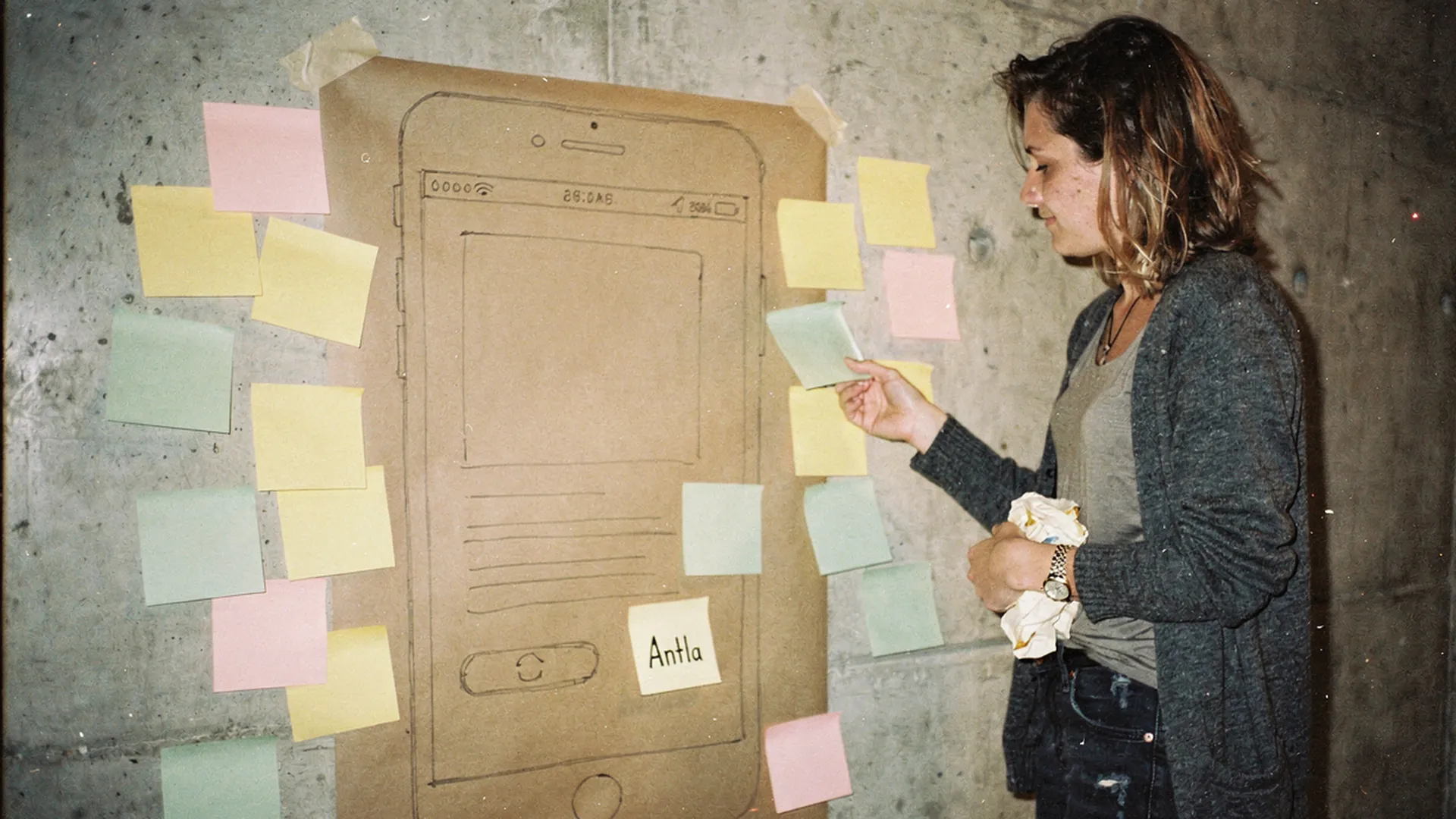
Most of the job is peeling things off. The one note that stays is the one with a job. Editorial image in Classic Antla disposable-camera style.
Take a typical mid-priced dress page and count what sits above the add-to-cart button: a sale badge, a free-shipping bar, a star rating, a wishlist heart, a share icon, four payment logos, a pay-in-four message, an “only 3 left” counter, a delivery estimator, color swatches, size buttons, a size guide link, and a chat bubble floating over the corner. That is fourteen things competing for one thumb before anyone has picked a size.
Adding try-on as item fifteen will not make it stand out. It will make it one more badge. Getting try-on onto a busy page is mostly subtraction, and the subtraction should come first.
Audit current controls
Start with an inventory, not a mockup. List every element between the product title and the add-to-cart button, write down the job each one does, and find evidence that shoppers use it. Click tracking, custom events, and a handful of session recordings are enough. If nobody on the team can say what an element is for, it is the first candidate to go.
| Element | Job | Evidence to check | Typical decision |
|---|---|---|---|
| Size guide link | Answers sizing | Opens per product view | Keep, touching the size buttons |
| Payment logos | Shows accepted methods | Checkout shows them again | Move below the button, or drop |
| Pay-in-four message | Softens the price | Installment share of orders | Keep one line of text, lose the logo |
| Share icon | Social sharing | Taps per 1,000 views | Move to the bottom of the page |
| Stock counter | Urgency | Is it live and true? | Remove unless it reads real inventory |
| Chat bubble | Support | Chats started on product pages | Keep, but never covering the buy button on mobile |
| Delivery estimate | Arrival date | Questions to support about timing | Keep near the button |
The last row is a warning against cutting too much. Baymard’s survey of why shoppers abandon orders found that, once people who were just browsing are set aside, 40% of US shoppers had abandoned because extra costs were too high and 20% because delivery was too slow. Cost and delivery information earns its space. Share icons and decorative badges usually do not.
Write the decision next to each row before anyone designs anything. The inventory also tells you where try-on can go, because an element you move out of the buying area leaves room for the one you are adding.
Use progressive disclosure
Progressive disclosure means showing what the shopper needs at this moment and revealing the rest when they ask for it. For try-on, that comes down to five rules:
- One entry point, one label. A text button that says “Try it on” beats an icon on its own, because a bare camera icon reads as photos or sharing.
- Put it where the question comes up. Under the color swatches or on the gallery works. The sticky add-to-cart bar, a floating widget, and a popup that opens by itself do not.
- Open it in a dialog. The page behind stays intact, so the shopper returns to the same scroll position with the same color and size selected.
- Collapse the rest. Fabric, care, and full delivery details can live in accordions below the button, where shoppers who want them will look.
- Never show it twice. If the button sits in the gallery, remove any second copy lower on the page.
Placement between color and size gets its own treatment in the guide to try-on and size selector order. The short version: after color, clearly apart from sizing help.
If the default button clashes with your theme, you do not need to keep it. Antla documents how to hide the default button and call its dialog from your own theme button, including a custom button inside the image gallery. One consistent button in your own type and colors adds less visual noise than a widget that looks bolted on, which is also the argument behind the research on processing fluency on fashion product pages.
Check loading and accessibility
A clean-looking page can still feel cluttered if it jumps around while loading or traps a keyboard user inside a dialog. Check both before launch.
Loading. Google’s Core Web Vitals set the thresholds most teams use: Largest Contentful Paint within 2.5 seconds, Interaction to Next Paint of 200 milliseconds or less, and Cumulative Layout Shift of 0.1 or less, measured at the 75th percentile of page loads and split by mobile and desktop. A try-on button touches all three if it is careless:
- Reserve the button’s space in the layout so it does not shove the price or buy button down when it appears.
- Load the upload screen and preview machinery after the tap, not with the page.
- Keep the button’s own script small enough that tapping swatches stays quick.
Shopify’s Built for Shopify requirements say an app must not reduce the storefront Lighthouse performance score by more than ten points. Use the same yardstick for any app you add: run Lighthouse on the product template before and after, on mobile settings, and compare. Lab scores are a check, not a verdict, so confirm with field data once real shoppers arrive. The notes on theme compatibility for virtual try-on cover the theme-side issues that usually cause trouble.
Accessibility. Two standards cover most of what a try-on entry point needs:
- Target size. WCAG 2.2 target size (minimum) asks for pointer targets of at least 24 by 24 CSS pixels, or enough spacing around smaller ones. Small icon buttons squeezed between swatches often fail.
- Dialog behavior. The WAI-ARIA modal dialog pattern says focus should move into the dialog when it opens, Tab and Shift+Tab should stay inside it, Escape should close it, and focus should return to the button that opened it. It strongly recommends a visible close button.
Then test by hand. Walk the whole flow with a keyboard only, then with VoiceOver on an iPhone and TalkBack on an Android phone. Listen for three things: whether the button announces what it does, whether the photo upload control has a label, and whether the finished preview is announced at all.
Measure engagement
Treat try-on as a funnel with its own steps, then check that the rest of the page did not pay for it.
| Step | How to count it | What a weak number usually means |
|---|---|---|
| Button seen | Visibility event on the button | Placement too low, or buried among badges |
| Dialog opened | antla_modal_open | Label unclear, or the button looks decorative |
| Photo uploaded | antla_image_upload_success | Upload step feels risky or slow |
| Preview generated | antla_image_generated_success | Errors or waiting; check antla_image_generated_error |
| Added to cart | antla_product_added_to_cart, or your theme’s cart event | The preview did not settle the doubt |
Alongside the funnel, keep three guardrails: the add-to-cart rate across all product page sessions, field Core Web Vitals for the product template, and size guide opens. If try-on engagement rises while any guardrail falls, the page got more cluttered, not less.
Engagement numbers need context. Antla merchant reporting, cohort dates not published, shows shoppers who use try-on staying two to three times longer on site. Longer visits only count when they end in better decisions, which is the point of reading product page engagement as a predictor of conversion quality rather than as a goal. Antla’s try-on intelligence dashboard shows engagement by product, which makes it easier to spot the pages where the button is ignored.
To read impact, compare products with try-on against similar products without it over the same weeks, rather than comparing this month with last month.
When decluttering backfires
- Cutting information shoppers need. Costs, delivery dates, returns terms, and the size guide belong near the button even if they look busy.
- Hiding try-on so well nobody finds it. If opens per product view are low next to your other interactive elements, test a more visible spot before concluding shoppers do not want it.
- Swapping one clutter for another. Moving six badges into a carousel is not removal.
- Judging on looks. A calmer screenshot proves nothing. The guardrail metrics decide.
Remove two, add one
Before adding try-on, remove two elements from the buying area that your inventory says nobody uses. Add one plainly labeled “Try it on” button under the color swatches, reserve its space, and check the dialog with a keyboard and a phone screen reader. Then watch opens, completed previews, and all-session add-to-cart rate for two full weeks.
Antla installs from the Shopify App Store without code on Online Store 2.0 themes, and the setup guide for no-code virtual try-on on Shopify walks through placement.
About the author: Aaron founded Antla and would rather delete a badge than design a better one.