

What to Show Beside a Virtual Try-On Preview
Beside a virtual try-on preview, show the product, price, and exact variant, one honest line on what the image cannot tell, separate size help, and a buy button.

Beside a virtual try-on preview, show the product name, price, and the exact color being previewed; one short line explaining that the image simulates appearance and does not check size or fit; a link to size guidance kept visually separate from the preview; and an add-to-cart action for that same variant. Leave review walls, upsell carousels, and countdown timers on the product page behind the dialog.
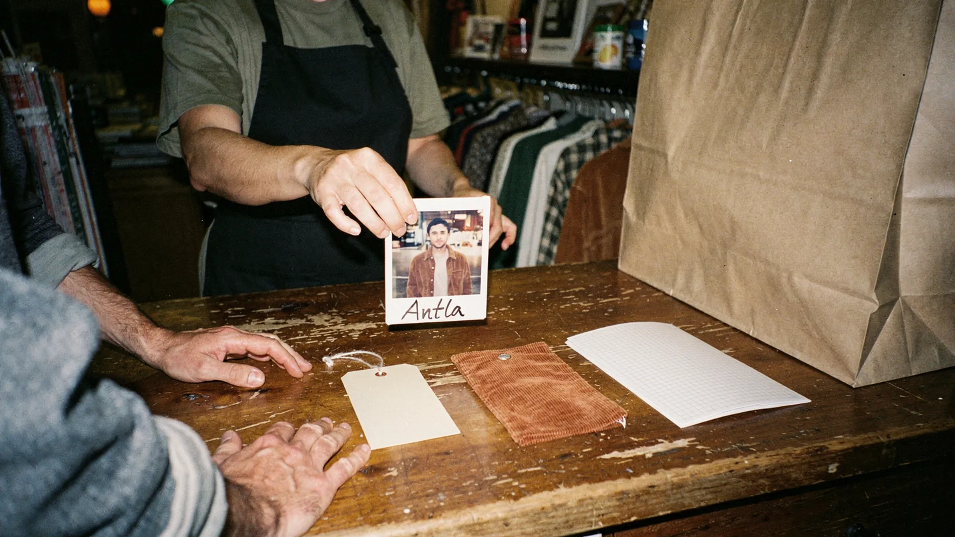
The photo sells the jacket. The tag, the swatch, and the size card close the sale. Editorial image in Classic Antla disposable-camera style.
A shopper uploads a photo, waits a few seconds, and sees herself in the rust corduroy jacket. She likes it. Now look at what surrounds the image. On plenty of setups, very little: the preview, a close button, and a walk back to the product page, where she has to find the color again, choose a size, and scroll down to the buy button.
The preview did its job. The frame around it did not. In a physical shop, the equivalent moment comes with a hang tag, a swatch, a size card, and a bag waiting on the counter, and the panel beside a try-on preview should do the same work.
Provide product and variant details
The shopper has just seen one specific version of one product on herself. The panel should confirm exactly which one, in words that match everything else she will see.
| Detail | Why it belongs beside the preview |
|---|---|
| Product name | Confirms which item generated the image |
| Price, including any sale price | Removes the trip back to the page to check |
| Color name, exactly as on the swatch | Ties the preview to a variant she can buy |
| The product photo the preview used | Lets her compare the simulation with the real garment |
| One line on fabric or finish | Explains texture the preview may flatten, such as brushed corduroy or satin |
The color name deserves care. Google’s Merchant Center rules for the color attribute require the color in your product data to match the color on the landing page, with the example that “Toasted Walnut” on the page means submitting “Toasted Walnut”, not “Brown”. Apply the same discipline inside the preview panel. If the swatch says Rust, the panel says Rust, the cart line says Rust, and the feed says Rust.
If you build your own panel around Antla’s events, most of these details already arrive in the payload: product data with the title and price, the selected_variant, the input_product_image used for generation, and the output_try_on_image itself. Showing a small thumbnail of the source photo next to the preview is cheap, and it quietly answers “is that what the real one looks like?”
Explain simulation limitations
One plain sentence, placed next to the image, does more than a paragraph hidden behind a link. Something like:
AI preview of how this piece may look on you. Color and drape can differ from the real garment, and it does not check size or fit.
That line sets an honest expectation without talking the shopper out of the purchase. It also keeps the store on the right side of its own marketing. The FTC’s guidance on keeping AI claims in check warns that performance claims are deceptive if they lack scientific support or hold only for certain users or under certain conditions, and a preview’s accuracy does depend on conditions: the light in the shopper’s photo, her pose, and her screen.
So name the conditions that help. A short tip before upload, such as “Works best with a well-lit, front-facing photo”, improves results and explains in advance why a dim selfie produces a dim preview.
Three things to avoid:
- Disclaimer walls. A block of legal text beside a personal image reads as the store bracing for complaints.
- Fit language anywhere in the panel. “Your perfect fit” undoes the honest sentence right next to it.
- A tooltip as the only disclosure. Most shoppers on phones never open it.
The expectation gap is also where many style returns begin, which is the argument in the piece on cognitive dissonance and the fashion returns expectation gap. Telling shoppers what the preview cannot show narrows that gap rather than widening it.
Show size guidance separately
Size help belongs in the panel, just not on top of the preview. The image looks the same whichever size is selected, so a size recommendation printed over it implies a connection that does not exist.
Give sizing its own block below the image, headed something like “Size and fit”, and include:
- the size selector, if a size has not been chosen yet
- a size guide link placed right beside that selector
- the model’s height and the size they wear in the product photos
- garment measurements for the selected size, when you have them
That layout follows Baymard’s research on apparel size information, which recommends keeping the size guide link near the size selectors and treats model measurements as useful context for choosing a size.
One line of microcopy clears up the most common confusion: “Your preview looks the same in every size. Use the size guide to choose yours.” It sounds obvious. It is not obvious to a shopper who has just seen a convincing image of herself.
The difference between the two kinds of help is covered in depth in virtual try-on vs size charts, and the wider set of fit signals shoppers look for is in the guide to fit confidence in fashion ecommerce.
Include purchase action
The strongest moment of intent on the whole page is the second a shopper likes her preview. The panel should let her act on it without starting over.
- One primary button for the previewed variant. If no size is selected, the button asks for one instead of guessing.
- Confirmation in place. Antla can add the product to the cart from inside its flow, and its sidecart integration shows how to open your theme’s cart drawer when that happens, so the shopper sees the item land without leaving the preview.
- Returns terms next to the button. In Baymard’s survey of cart abandonment reasons, 13% of US shoppers who abandoned, setting aside those just browsing, blamed an unsatisfactory returns policy. One line with the window and cost is enough.
- Secondary actions that look secondary. Saving or sharing the preview is useful, but it should never compete visually with add to cart.
Then check the handoff. The cart line should show the same color the shopper previewed, and the size she chose. A mismatch at this point costs more than any missing detail, because she will only notice it when the parcel arrives.
When the panel works, returns can move too. Antla merchant reporting, cohort dates not published, has seen returns fall by up to 30% versus the same store’s pre-try-on return rate, and results vary by store and category. Treat that as an association, not proof of causal lift. Read which return reasons change: a preview speaks to color and style, so those reasons are where an effect should show up, not size returns. The walk-through of how virtual try-on reduces returns before checkout covers how to measure it.
What stays off the panel
- Review walls. Reviews matter, but they belong on the product page, where a shopper can read them before or after the preview.
- Upsell carousels. Suggestions for other products pull attention from the one she just pictured herself wearing.
- Countdown timers and newsletter prompts. They turn a personal moment into a sales routine.
- Equal-weight buttons. When “Share”, “Save”, “Try another”, and “Add to cart” look the same, the shopper has to decide what the page wants.
The underlying rule matches the one for adding try-on without cluttering the PDP: every element needs a job tied to the decision in front of the shopper.
Sketch the panel on paper first
Draw five labeled boxes: product and variant, the preview, the one-line note, size and fit, and add to cart. Anything else that wants a box needs a reason connected to this decision. Build that version, tap through it on a phone, and confirm the cart line matches the preview.
Antla’s full customization covers the popup’s copy, colors, and explainer content, so the one-line note can sound like your brand rather than a legal department. You can install Antla from the Shopify App Store and build the panel around your own products.
About the author: Aaron founded Antla and still thinks the best try-on panel looks a lot like a good shop counter: a tag, a swatch, a size card, and a bag.