

How to Keep Customers on Your Fashion Site Longer
Fashion sessions end early because nothing on the page invites interaction. A diagnosis of where dwell leaks, plus the fixes that actually hold shoppers.

Watch twenty session recordings from a fashion store and the pattern repeats itself with almost no variation. The shopper lands on a collection page, scrolls, taps a dress, scrolls the gallery, opens the size chart, closes the size chart, goes back, taps another dress, and leaves. Forty seconds. No cart, no exit intent popup that helps, nothing to blame.
She was not bored. She ran out of things to do. The page gave her four photos and a table of measurements, and once she had consumed those, the only remaining action was leaving.
To keep fashion customers on site longer, give them a useful action before the gallery runs out. Virtual try-on is an active fit and styling task rather than another piece of content. Antla merchant data shows try-on users spend roughly two to three times longer on site, but that extra time matters only when it advances a product decision.
Start with the exact place the session dies. More content will not fix a page that has already answered every question it knows how to answer.
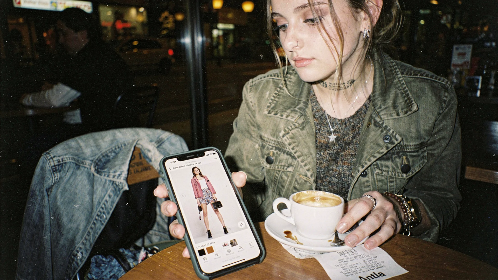
Sessions stretch when there is something to do on the page, not when there is more to read. Hero shot in Classic Antla disposable-camera editorial style.
Longer only counts when the time does work
Time on site is a proxy, and a leaky one. A shopper stuck in a broken filter is on your site for a long while and hates every second of it. A shopper reading your shipping policy three times is not close to buying.
The version worth chasing is time spent evaluating a specific garment. She is comparing two colorways, checking how the hem sits, deciding between her usual size and one down. That kind of time correlates with orders because it is the actual decision process, happening on your page instead of in her head three days later.
So the goal is not longer sessions. It is more decision-making per session. Everything else is a vanity chart, and product page engagement and conversion quality goes deep on separating the two if you need the measurement side in detail.
Where fashion sites leak time
Dwell does not leak evenly. It leaks in four specific places, and the fix is different in each one.
The collection grid. Every thumbnail is the same studio shot on the same model at the same distance. Nothing differentiates one midi dress from the next, so the shopper cannot form a shortlist and taps at random. Grids that mix flat lay, on-body, and detail crops give her something to sort by.
The gallery. Five photos of a garment on a 5’10” model tells a 5’3” shopper almost nothing about proportion. She scrolls the gallery once, gets no new information, and stops.
The size chart. She opens it, finds numbers she cannot map onto her own body, and closes it having learned that she is between sizes. Why size charts fail on Shopify fashion stores covers why measurements alone rarely resolve that.
The variant switch. Choosing a color reloads a hero image that may or may not show the color she picked. Broken variant media reads as carelessness, and carelessness shortens sessions.
Baymard’s apparel and accessories research documents how consistently incomplete product information sits behind abandonment on fashion pages. Incomplete does not mean short. Plenty of stores publish long descriptions that answer none of the questions a shopper is actually holding.
Why more photography stopped working
The instinct is to shoot more. Add a second model, add a video, add a 360 spin. It helps, up to a point, and the point arrives fast.
Every extra asset is still someone else’s body. A shopper looking at a boxy cropped jacket wants to know whether it ends above or below her own waistband, whether the shoulder seam will sit wide on her frame, whether the sleeve length reads intentional or accidental on her arms. No amount of model photography answers those questions, because the questions are about her.
On Shopify’s own reading of what a product detail page is for, the page exists to settle every open purchase question. In apparel, a subset of those questions is structurally unanswerable with photography of anyone else. That is the ceiling merchants keep hitting when they invest another quarter into content and see engagement flat.
The interaction that holds attention
Interaction beats consumption for one boring reason: consumption ends, and interaction loops.
A try-on session on a PDP goes like this. She uploads a photo, sees the garment rendered on her own body, and immediately has a new question. What about the other colorway. What about the version with the longer hem. What about this jacket over the dress she was looking at two pages ago. Each answer generates the next question, which is why sessions stretch rather than snap shut.
Shopify’s virtual fitting room research identifies fit and style uncertainty as the two barriers a preview tool has to clear. When it clears them, engagement rises as a side effect of the shopper finally having a way to test her hypothesis.
That two-to-three-times engagement figure from Antla virtual try-on merchants is not evenly spread. It concentrates in categories where silhouette is doing the work: dresses, tailored outerwear, denim with an opinion about rise. Basic tees barely move, because nobody was uncertain about a tee.
Engagement also has to convert to be worth anything. Across Antla stores, the try-on cohort converts at an average lift of 35% over non-users on the same products, and on some women’s PDPs merchants report conversion roughly doubling. Shopify’s conversion rate benchmarks are a useful reality check on the baseline you are lifting from.
Placement mistakes that end the session early
Most disappointing rollouts are placement failures, not technology failures.
Below the fold on mobile. If the try-on entry point sits under the description accordion, a shopper can finish the visible gallery and leave without knowing the tool exists.
Behind an account wall. Asking an anonymous first-time visitor to create an account before she can try something on converts curiosity into a bounce.
Buried in a tab. Tabs are where merchants put content they have given up on. A fit tool in the third tab is decoration.
A render with no progress feedback. Even a brief silent wait reads as broken. Show that the image is processing and keep the shopper on the product she selected.
No path forward after the preview. She sees herself in the jacket and the page offers no obvious next step. Put size selection, other colorways, and add-to-cart in her line of sight while the preview is still on screen.
Three signals worth watching
Keep the reporting light. Three signals tell you whether attention is doing useful work.
- Try-on start rate per PDP session, split by mobile and desktop.
- Previews per session, which is the loop indicator worth watching most closely.
- Add-to-cart rate for try-on users against non-users on the same SKUs.
Attribution matters more than volume. If you cannot compare the two cohorts on identical products, you will end up arguing about the tool instead of reading the result.
Common questions about time on site
How long should a fashion shopper stay on a product page?
There is no universal target. What matters is whether the time is spent evaluating the garment rather than hunting for missing information. Compare engaged time between shoppers who convert and shoppers who leave on the same SKUs, and use that gap as your working benchmark.
Does virtual try-on increase time on site for fashion stores?
Yes, when it is placed where shoppers can find it. Antla merchant data shows try-on users engaging roughly two to three times longer than non-users, driven by shoppers generating multiple previews across colorways and silhouettes rather than by any single longer view.
Why do shoppers leave fashion product pages so quickly?
Usually because the page runs out of useful information before the decision is made. Model photography, a measurements table, and a generic description answer questions about the garment but not about how it will look on the individual shopper, so she leaves to think about it.
Is longer time on site a good goal for an ecommerce team?
Only as a diagnostic. Long sessions caused by confusion, slow loading, or broken filters are a cost. Pair any dwell metric with add-to-cart rate and conversion quality so you can tell productive engagement from friction.
Keep digging into engagement
- Shopify fashion growth use cases to see how this job sits beside the other nine
- Website personalization for fashion ecommerce for holding attention when the visitor is anonymous
- Show customers how they will look in your clothing for the five methods compared on cost and scale
- Virtual try-on benefits for fashion stores for how engagement ranks against the other outcomes
About the author: Aaron is Antla’s founder. He started the company because product photos of other people’s bodies kept sending him back to the post office, and he now spends his time on the Shopify side of that problem. He watches session recordings for fun, which he accepts is a strange hobby.
Pick your worst-performing high-traffic category, then watch ten recordings and note where the session dies. If it dies at the gallery or the size chart, install Antla on Shopify, put the try-on entry point beside your primary media, and compare the two cohorts on the same SKUs after thirty days.